A fresh new look for the Bird Journal website
A little while ago we gave the blog a fresh new home, and promised more to come. Today it’s the website’s turn: birdjournal.com has been redesigned from the ground up — and it’s a far better reflection of Bird Journal itself.
A look that’s more in step with the app
For a while now the website and the app have felt like they came from two different places. The whole site has been rebuilt to draw on the same design language as Bird Journal — the calm slate-blue, the warm orange highlights, the clean type and generous spacing you know from using it day to day. They’re not identical, but they’re far more of a piece now, so moving from one to the other feels a good deal more natural.
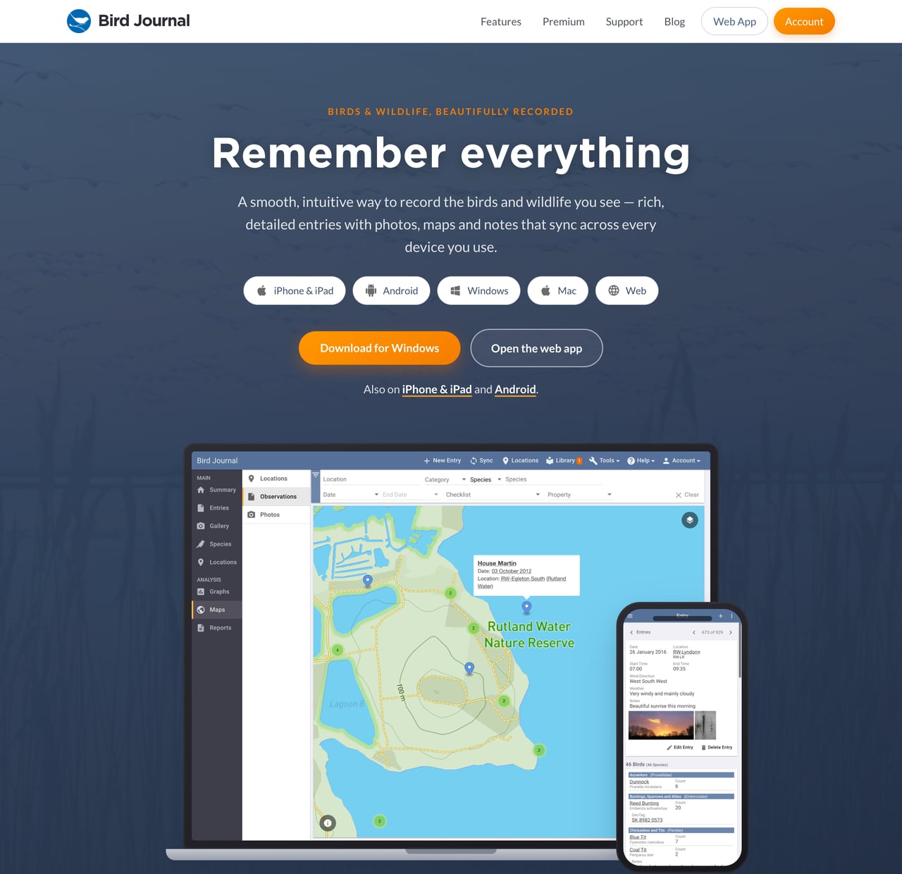
Real Bird Journal, on every screen
The old site leaned on illustrations to show off what Bird Journal could do. The new one shows you the real thing: actual screenshots of your entries, maps, graphs and the photo gallery, set in crisp laptop and phone mock-ups right across the homepage.
The new homepage walks you through what Bird Journal is really for: capture a rich record of everything you see, relive your best moments in the gallery, and explore it all through beautiful graphs and maps — with your records kept safely in sync across the devices you use.
Clearer about what’s free and what’s premium
We’ve also taken the chance to be much clearer about how Bird Journal is offered. There are now simple, side-by-side cards laying out exactly what you get for free and what a Premium subscription adds, with no small print to squint at — and a redesigned premium page that does justice to everything Premium unlocks.
Tidied up throughout
It’s not just the homepage. The about, download, terms and privacy pages have all had the same care, the navigation and footer have been refreshed (with proper links to find us on Facebook and X), and the whole site is faster and reads beautifully on phones and tablets as well as desktops.
Part of something bigger
This refresh is the latest in a busy run for us — hot on the heels of the web app arriving on phones and tablets and faster, more dependable desktop apps. It felt like the right moment for the website to look as modern and capable as the app it’s there to show off.
Do take a look around — and as ever, thank you for your continued support. We’ve got more in the works that we’re genuinely excited about, and we can’t wait to share what’s next.