
Mobile Recording, Rebuilt
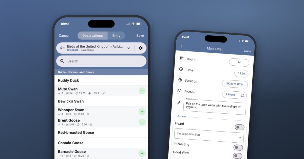
When we brought the full Bird Journal experience to iOS and Android in June, we were open about one deliberate gap. The screens you actually use to record what you’ve seen were left exactly as they were — and we said that reworking them from the ground up was where we were headed next.
That’s what this update is — and it turned out to be far more than a rebuild.
Why recording was always the poor relation
The old add-and-edit screens were native: one written for iOS, another written separately for Android, and neither shared anything with the input screen in the main app on your computer. Three separate recording experiences, for one job.
That arithmetic is what held them back. Every idea had to be designed and built three times over, so in practice it got built once — where most people do most of their work — and the phones made do with what they already had. The two mobile screens quietly diverged, Android’s pulled ahead of iOS’s, and neither ever got the attention it deserved. It’s not that we didn’t know what they needed. We just could never justify doing it three times.
One screen, made for your thumb
So there’s now one recording screen, shared by both apps, built fresh. It’s the same idea as the rest of the mobile rework: build it once, and both platforms get it — along with every improvement that follows.
Underneath, we chose the technology specifically to keep it feather-light and immediate. Recording is the one thing in Bird Journal that happens with a bird in view and a finger already moving, so nothing here waits on anything. And it wears the latest Material 3 design, so it feels current and at home on a modern phone.
We started by mirroring the Android experience, which was the more capable of the two, and brought iOS up to meet it — so if you’re an Android user, everything you knew is still where you left it. Then we kept going, and this is where the update stops being a port and starts being new.
The list you record from
The species list is where a session actually happens, so it got the most thought.
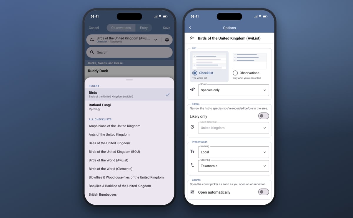
- The checklist is right at the top, and it’s a button. Tap it and swap to another list — a different taxonomy, a different wildlife group, whatever you’re recording today — in a single tap, with its options sitting beside it.
- Options that match the desktop. Show species, subspecies or codes; narrow the list to species you’ve recorded in the area before; choose how species are named and ordered.
- Every species tells you what you recorded. A recorded species carries a compact summary right under its name — how many observations, the total count, the span of times, and small marks where there’s a photo, a position, a note or a custom field. You can read a whole morning off the list without opening anything.
- The + only appears where it means something. Once a species is recorded, a quiet green + appears on its row to add another observation of it. Before that, there’s nothing there to puzzle over.
Two lists, and you choose which
One option deserves more than a bullet, because it changes what the screen is for.
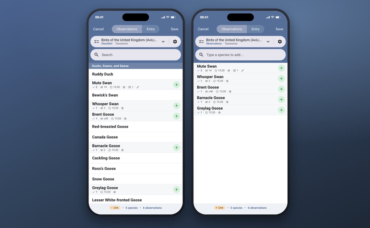
Checklist gives you the whole curated list to browse and record from — the way you’d work a site with a list in front of you. Observations strips it back to just what you’ve recorded, and lets you add a species simply by typing its name.
That second mode transforms the two jobs the old screens were worst at:
- Editing an entry you’ve already made. Open it and you see your own record — the species, the counts, the times — instead of having to hunt them down again among thousands of others.
- Writing up from notes. Adding a day from your notebook, or a trip from years ago, becomes typing a name, setting a count and moving on. No scrolling a world list for every bird.
It’s the same choice the desktop app has always offered, and on the phone it’s drawn as a picture of each list rather than a switch, so you can see what you’re choosing before you choose it.
Seen it. Next.
The fastest recording is the recording you don’t have to open a screen for.
Hold a species to record it. Press and hold its row for a moment and it’s logged — with the time and your position on it, if Live Input is on — without ever leaving the list. Hold the + on a species you’ve already recorded and you get another observation of it the same way. It’s deliberately a hold rather than a tap: a tap is far too easy to do by accident, and nothing that writes a record into your journal should be that easy to trigger.
Inside an observation
Open an observation and there’s a great deal more there than there used to be.
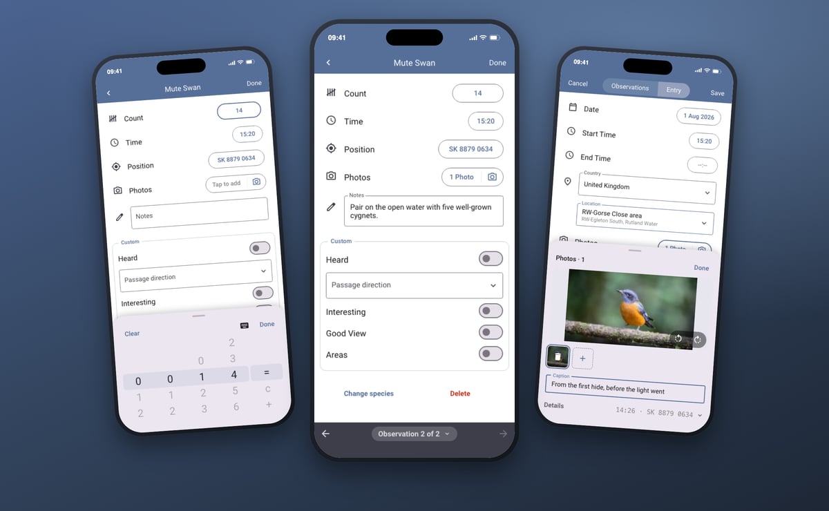
- Counts are quick. Roll each digit like a dial, or type the number if you’d rather, and mark a count as approximate or at least without leaving the picker.
- Time and position, visible at last. You can now see, set and correct what Live Input recorded. Position opens a map you can search or simply tap, or you can type a grid reference or a latitude and longitude straight in.
- Photos — for the very first time on mobile. The old recording screens had no photos at all. Now you can attach them from your camera or your library, to a single observation or to the whole entry, with captions and rotation, and Bird Journal reads the time and position out of the photo itself.
- Correct a mistap. Picked the wrong species? Change species re-points the observation without losing the count, the time, the photo or anything else on it.
- Move between observations without backing out. Step through a species’ observations with the arrows or a swipe, tap the counter to see them all at a glance, and add another from there.
Setting up the entry
The screen you meet first got the same treatment.
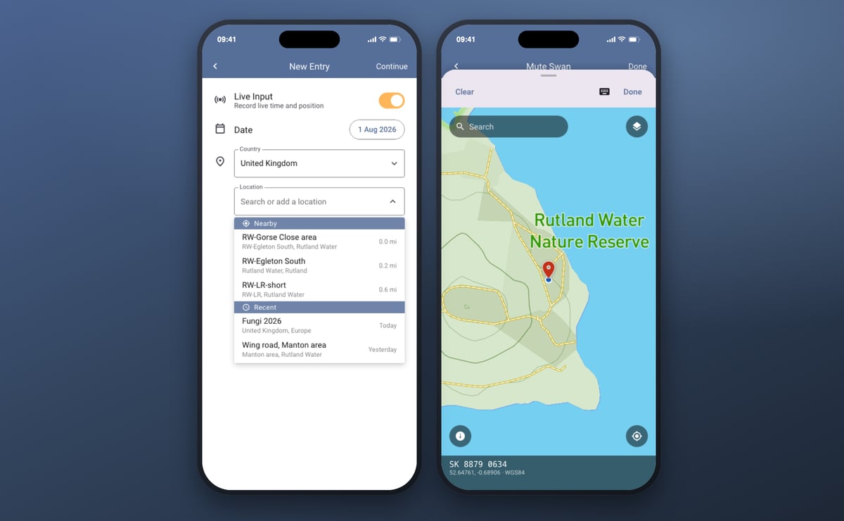
- Nearby locations come first. Your own locations within about 25 miles, closest at the top, so the place you’re standing in is usually the first thing you see — followed by the places you’ve recorded at recently.
- Add a location by typing its name. It’s created with the entry, and it remembers where you were when you made it.
- Live Input stamps every observation with the time and the position as you record it — and the Entry tab now fills in the times of the session around it.
- Conservation details, on the Entry tab: record type, number of observers and effort, for eBird, BirdTrack and survey records.
- Everything else you’d expect is there too — date, weather, notes, photos for the whole entry, and your own custom fields.
The small things
- A session bar sits at the foot of the list showing whether Live Input has a fix, and your running totals for the session — species and observations, always in view.
- If your phone gets interrupted mid-entry, Bird Journal offers to pick up where you left off next time you open it.
- Long checklists stay quick — the list loads only the part of it you’re looking at, so a world taxonomy scrolls as smoothly as a garden list.
Have a look, and tell us what you think
The new recording screen is rolling out now on iOS and Android — update your app and tap + to add an entry.
There’s more to come, too. Voice — saying a species rather than typing it — is one of the things we’re exploring as a next step, along with plenty else.
Most of all, please tell us how it goes. There are feedback options built right into the app under the Help menu, and we read every one.
And if you’d like to see this sort of thing before everyone else, we’d love to hear from you: we’re particularly keen to find more beta testers on Android and iOS. The mobile test groups are still put together by hand, so rather than a switch to flick, just get in touch and we’ll set you up.
After years of the mobile recording screens being the part of Bird Journal we most wanted to fix, it’s a genuine pleasure to hand this one over.