Bird Journal on Mobile, Transformed
We’ve just released major updates to both our iOS and Android apps — and they’re the most far-reaching changes either app has had since it first launched. In truth this is one of the most significant things we’ve done across the whole of Bird Journal since version 5 arrived ten years ago. For the first time, the apps in your pocket run the full Bird Journal experience.
Why mobile always lagged behind
If you’ve used Bird Journal on a phone, you’ll know the apps have long been the poor relation. There was a good reason for it, even if it was never much comfort: for years the iOS and Android apps each carried their own, entirely separate user interface, built apart from the main Bird Journal app on desktop and web.
That meant every feature effectively had to be built three times over — once for the main app, and again for each mobile platform. So it’s no surprise that the bulk of our effort went into the main app, where most people do most of their work, and the mobile apps steadily fell behind, missing features that desktop and web users had come to take for granted.
One Bird Journal, now in your pocket
These updates fix that at the root. Instead of maintaining a separate mobile interface, the iOS and Android apps now run the very same core Bird Journal experience you already know from the desktop and web app, hosted natively on your device.
The result is simple to say and enormous in practice: features that were previously unavailable on mobile are now simply there. The same records, the same tools, the same depth — kept perfectly in sync with everywhere else you use Bird Journal.
It changes the future, too, not just today. With one shared experience to look after instead of three, the work no longer has to be done over and over for each platform — so from here on, the improvements we make arrive everywhere at once. The mobile apps will grow right alongside the rest of Bird Journal rather than trailing behind it.
Everything that was out of reach
Here’s a taste of what’s now at your fingertips on a phone or tablet — much of which has simply never been possible in the mobile apps before:
- Import and export your records. Bring sightings in from files and other sources, and get your data back out whenever you need it — no longer something you have to reach for a computer to do.
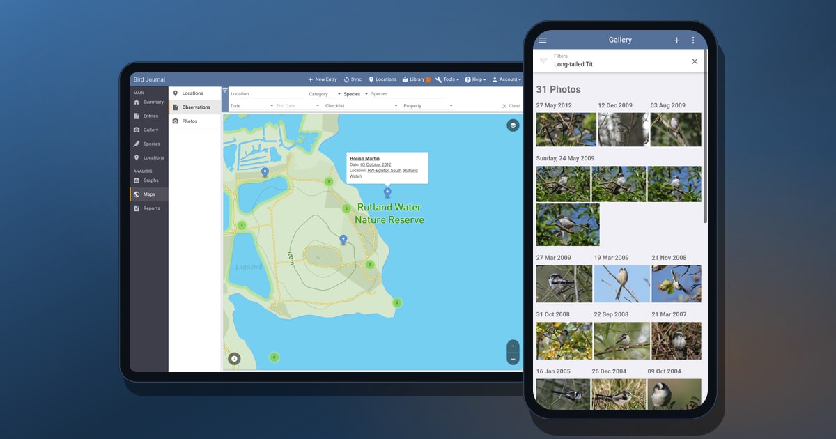
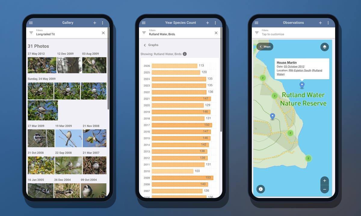
- The redesigned photo gallery. Every photo you’ve taken, in the tiled, day-by-day gallery we rebuilt recently — browse it, open any picture full-screen, and filter down to a single species, place or date in a tap.
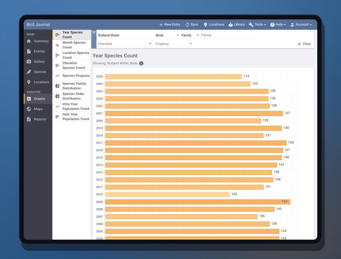
- Graphs. Year species counts, distributions, population trends and more, drawn from your own records.
- Maps. Detailed location, observation and photo maps, with every observation pinned to exactly where you saw it.
- Reports. The full set of reports, ready whenever you want to look back over what you’ve seen.
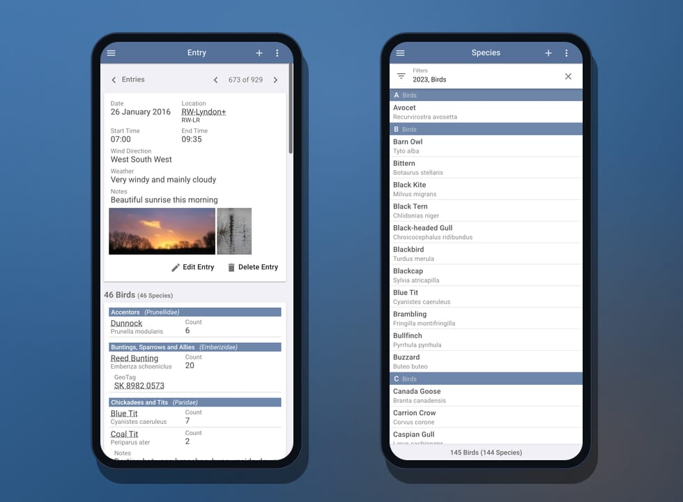
- Custom checklists, taxonomies and synonym packs. The library has always been on mobile, but now you can create your own custom checklists, taxonomies and synonym packs — and collaborate on them with others — rather than only browsing what’s there.
- Powerful taxonomy tools. View and manage taxonomic updates, and replace one species with another across your records — the kind of careful housekeeping that used to mean reaching for a computer.
It really is the same toolset you’ll find described across birdjournal.com — only now it travels with you.
Room to stretch out on a tablet
Because the apps share that one responsive experience, they make the most of whatever screen they’re on. On a phone everything reflows into a single, comfortable column; on a tablet it opens up into the full multi-pane layout — navigation, list and detail side by side — so an iPad or Android tablet now feels a lot closer to working at your desk.
A note on the recording screens
There’s one deliberate exception, and we want to be upfront about it. For now we’ve kept the original recording screens — the ones you use to add and edit a sighting — rather than dropping in the desktop input.
The main app’s input experience is genuinely excellent, but it’s tuned for a mouse and a generous screen, not for quick, one-handed entry out in the field. We didn’t want to disrupt anyone’s day-to-day recording flow by handing you an input screen that wasn’t built for a phone. So the familiar native add-and-edit screens stay in place for the moment. They’re obviously due plenty of improvement — and that’s exactly where we’re headed next.
What’s coming next
We’re keeping the pace up. One of our very next projects is to rework mobile recording from the ground up — a single, unified input experience that will likely stay consistent with the desktop where it makes sense, but be thoroughly optimised for touch and built on everything we’ve learned over the years. Before that, our immediate focus is a round of taxonomy updates — most notably bringing in AviList, the new unified global standard for bird taxonomy that so many birders have been asking us for.
None of today’s release would have been possible without some recent groundwork, either — making the web app fully responsive to screen size and touch, and the gallery rework that taught us how to make the most of every screen. It’s all been building to this.
Try it today
The updates are rolling out now on the App Store and Google Play — update your app, or install it fresh, and the full experience is right there. If you’d like to stay close to what’s coming, Premium subscribers can opt in as beta testers from the Account menu, and there are feedback options built right into the app under the Help menu.
As ever, thank you for sticking with us — especially through the years when the mobile apps weren’t all they should have been. We think this changes the picture entirely, and we can’t wait to hear what you make of it.