
Navigation, Within Reach
Someone wrote to us after the mobile rewrite with a complaint about getting around the app. It was a small thing, precisely described, and completely right. This update is that complaint, answered.
What we were told
Two things, and they turned out to be the same thing twice.
The menu button is in the worst corner. To move between screens you press the hamburger at the very top-left — which, on a large modern phone held in one hand, is about the hardest point on the display for a right thumb to reach.
And something had gone missing. The old native app used to have a row of buttons along the bottom — Summary, Entries, Species — for switching between the screens you actually use. One tap, always there. The rewrite quietly took it away, and nobody had said so out loud.
Put together, the everyday job of moving around the app had got harder, and the fix for it had been sitting in our own back catalogue.
The five screens, at the bottom
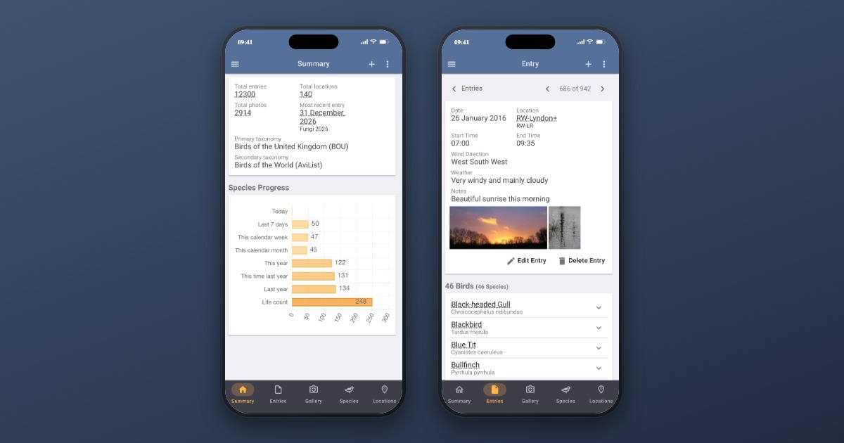
So the five main screens — Summary, Entries, Gallery, Species and Locations — now live in a bar along the bottom of the screen, one tap each. That’s them at the top of this post: the same app on two phones, one showing your summary and one an entry, with the bar carrying you between them in a single tap.
The principle we settled on is a simple one, and it’s worth stating because it decided everything else: the five screens you use most are never hidden behind a menu. Wherever the app shows a hamburger, the bar is there instead. The menu stays, and now holds what it’s actually good at — Reports, Graphs and Maps.
It stays with you
The bar doesn’t disappear the moment you open something.
Tap into an entry, or a species, and it’s still there with your current section lit — so moving from a species you were reading about to your entries is one tap, not a back-out and a menu. That’s the whole point of the change: it isn’t a shortcut that works from the top of a list, it’s navigation that’s there wherever you happen to be.
It does get out of the way for the two things that deserve the whole screen: adding an entry, and viewing a photo full-screen.
Made for the screen it’s on
Bird Journal follows Google’s Material Design, and one of the things Material gets right is that a bar of tabs shouldn’t look the same on every device. So it doesn’t.
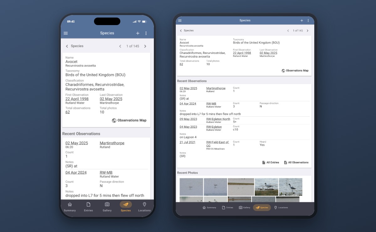
On a phone, each tab stacks its icon above its label, with the highlight drawn as a pill behind the icon — the compact arrangement, because a phone hasn’t the width for anything else.
On a tablet in portrait there’s room to breathe, so each tab lays its icon out beside its label, the highlight grows into a pill around the pair, and the whole group is centred rather than stretched to the edges.
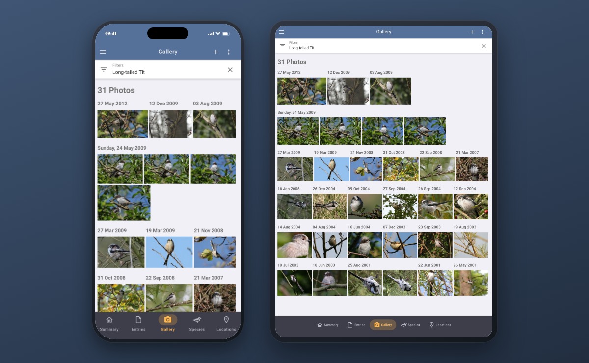
And on a wide screen — a tablet turned landscape, or Bird Journal on your computer — there’s no bar at all, because the sidebar is already open and already showing you all five. Adding a second copy of the same five destinations would be clutter, not navigation.
Why five, and why + stays put
The original suggestion included a variation we see in other apps: four screens along the bottom with a big + button in the middle for adding an entry. We looked at it seriously and decided against it, for now.
The centre-button pattern naturally wants five slots — two, the button, two — which means one of the five screens has to go. And the payoff isn’t as large as it looks: the button saves you a tap, but the screen it opens still asks you to reach the top-right to continue. The saving doesn’t carry through the rest of the job.
It’s not off the table. But it belongs with a proper one-handed way to record an entry from start to finish — genuinely useful when your other hand is holding binoculars — rather than on its own. That’s the version worth building.
While we’re here: what about your filters?
Now that changing screens is a single tap, something else gets more noticeable: your filter doesn’t come with you. Set up a filter on your entries, switch to species, and you start again.
That isn’t new, and it isn’t ours to claim we’ve fixed — Mike asked for exactly this back in 2016, and it’s been sitting on the ideas board ever since. His argument was a good one then and it’s a better one now: clearing a filter is one button press, but rebuilding one is real work.
If that’s something you’d like, add your vote to it. We do work from that board, and an idea with numbers behind it moves.
Rolling out now
The new navigation is rolling out on iPhone, iPad and Android — and in a narrow browser window, if that’s how you use Bird Journal on a computer. It’ll simply appear; there’s nothing to turn on.
As ever, please tell us how you get on. There are feedback options built into the app under the Help menu, and the support site is always open.
This one came from a single, well-argued message about a menu button in an awkward corner. If something in Bird Journal is quietly making your day harder, it’s worth telling us — that’s very often exactly how it gets fixed.