
A Map on Every Entry
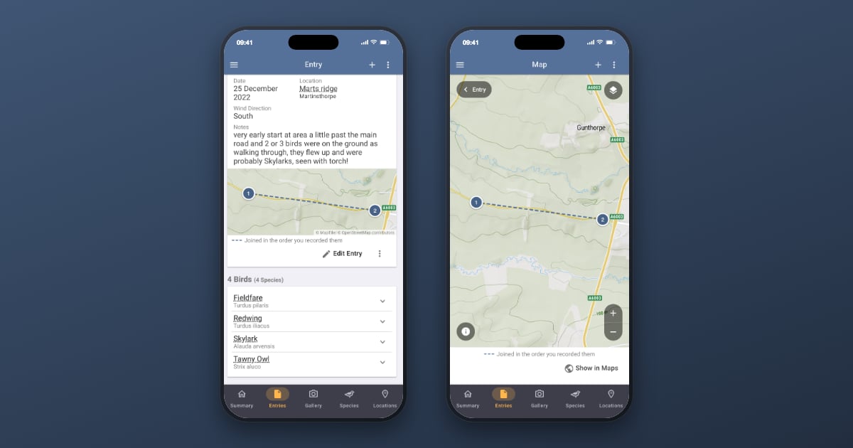
Open an entry in Bird Journal today and, at the foot of its first card, there’s a map of where you recorded. Open a location and there’s a map of where it is. Tap either and it fills the screen.
Free, for everyone. No subscription, and nothing to switch on.
What was actually missing
It would be easy to tell this as free accounts had no map at all — and that isn’t true, so let’s be accurate about it.
You could always get a position onto a map. The older native apps, on both iPhone and Android, showed one directly: a map, with a single pushpin on it. Since the rewrite, tapping the GeoTag on an observation has taken you through to the Maps section, and although Maps is premium, an exception there left that one observation visible to everybody. Clumsy, and further from the entry than it should have been, but it was there.
What you couldn’t do was see your entry on a map.
- It was one observation at a time — never a morning’s recording together, which is the thing worth looking at.
- It took you out of the entry, landing you in Maps with a back button to Maps rather than to the entry you came from.
- And it was an exception rather than a decision — a narrow gap in the premium overlay, not a promise anyone had made. It worked, but nothing about it read as deliberate, because it wasn’t.
Meanwhile the entry’s own card had no geography on it at all. A position belongs to each observation rather than to the entry, so the only trace of where you’d been was a grid reference or a latitude and longitude, tucked under individual species. A location with a GeoTag fared little better: its card gave the position as a line of text. A grid reference is a perfectly good grid reference. It is not a picture of anywhere.
And even with premium, nothing showed an entry’s observations together: the only route was the whole-record Observations map, filtered back down to the morning you’d just had.
So this isn’t us restoring something lost. A per-observation side door has become a per-entry view that doesn’t leave the screen — and where the free line falls is now something we’ve chosen rather than something that happened.
Your morning, on a map
The entry’s top card now carries a map of every position recorded in that entry, joined in the order you recorded them. Tap it and it opens full-screen over the entry — not in another section, with a back button to somewhere you weren’t. Close it and you’re exactly where you were; on a phone, the back gesture closes it too.
A few things about how it’s drawn, because we thought hard about them:
- Standing still doesn’t make a scribble. Record twenty species from one spot and you don’t get twenty pins in a five-metre huddle with a line threaded through them. Observations made within a few paces of each other become one numbered stop, and its pin tells you how many species are on it. Open a stop to see them listed — and tap one, and the map closes on that species’ own row in the entry, waiting for you.
- The line claims order, not a route. It’s dashed, gently curved, and runs pale to strong from your first stop to your last. That’s deliberate: it says this is the order you recorded in, not this is the path you walked. Better something modest and true than something confident and invented.
- When there’s nothing to draw, there’s nothing there. An entry with no positions on its observations falls back to its location’s pin, drawn differently so it can’t be read as a bird. If there’s no position worth showing at all you get no map — not an empty grey box, and not a nag asking you to add one.
And the location screen too
A location’s card now shows where the place is, opening full-screen the same way.
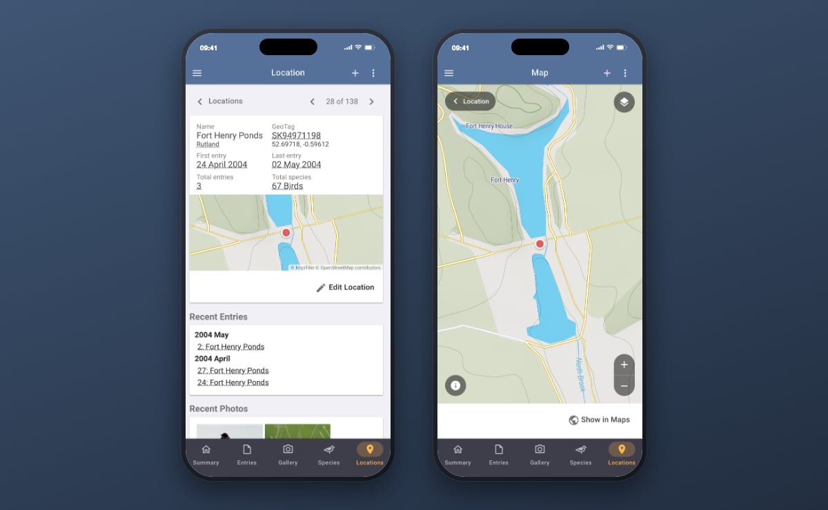
The rule for when it appears is a careful one: only for your own locations, with a position you gave them. Bird Journal’s built-in locations are countries, counties and states, and their “position” is the centre of an area — drawing that at a zoom that frames a birding site would be telling you you’d been somewhere you hadn’t.
While we were there: Edit Location now sits on the location’s own card. Correcting a name, a parent or a position used to mean the menu, then Locations, then finding the place again in a list that can run to hundreds. Now it’s one tap from the location you’re already looking at — and since giving a location a position is how its map appears, the two halves meet rather neatly.
Where the line falls
Since we’ve moved the line, it’s worth stating where it now falls.
Free is the one thing you’re looking at. Premium is across your whole record. One entry’s map, one location’s map — free, on every platform, for every account. Every observation you’ve ever made on a single map, with filters, layers, photos and clustering across years, is the Maps section, and that stays premium.
Sharper, and with more on it
The maps themselves have been rebuilt, and the difference shows straight away.
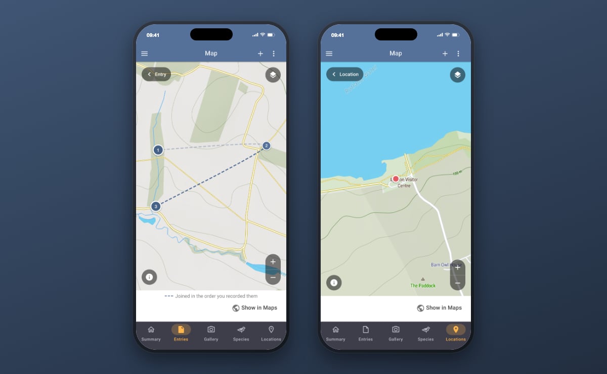
Labels stay crisp instead of going soft and blocky as you zoom — place names, road numbers and contour heights drawn at your screen’s own resolution rather than scaled up from something smaller. There’s more on the map, too: where you’d previously get a town and a main road, you now get the villages, the lanes, the streams and the field boundaries around them. Panning and zooming are noticeably quicker as well, which matters most where it’s hardest to test — on a phone, one-handed, putting a pin on the right side of a hedge.
It works with no signal
This is the one we’re happiest about.
Bird Journal now keeps map ground on your device. Not a “download this area for offline” mode you have to remember before setting off — just the ordinary consequence of having looked at somewhere already. Go back to a patch you’ve seen before and it simply draws, with no connection at all.
For a great deal of birding, that’s the whole game. The reserve at the end of a single-track road, the hill with one bar on a good day, the coastal marsh where the phone gives up entirely — these aren’t edge cases, they’re Tuesday. A map that needs the internet is a map that isn’t there when you’re actually out.
And somewhere genuinely new with no signal, it doesn’t simply fail. Your own positions live on your device, so the stops and the line between them are still drawn, with a note explaining that the ground underneath needs a connection. It fills itself in the moment you’re back in range.
Two smaller things
- Setting a position is now a drag. A pin sits fixed in the middle of the picker and you move the map underneath it until it’s where you want it — far easier than dropping a marker accurately under your own fingertip.
- Edit Location, as above — small, and long overdue.
Getting it
The new maps are live now on Bird Journal Web, Mac, Windows, iPhone and iPad — update your app and open any entry. The Android update is with Google and still in review, so it’ll follow in the next few days as an ordinary update; there’s nothing for you to do.
One more thing, eventually
The most-voted idea on our ideas board is route tracking — recording the path you actually walked, not just the points you stopped at. It has been top of that list a long time, and it has been read.
We’re not announcing it and there’s no date. But the way these maps are drawn was chosen with it in mind: the order line is dashed precisely so that a real recorded track — solid, and meaning something quite different — could one day sit beneath the same stops without either being mistaken for the other. The groundwork points that way.
In the meantime, please tell us how the maps get on out in the field, which is the only place they really count. There are feedback options built into the app under the Help menu, and the support site is always open.